THE PURPOSE
I am passionate about helping people find their people. I believe that everyone deserves to be a part of a supportive and inclusive community, with the ability to share their interests and passions.
In this project, designers were tasked with conceptualizing a company big or small - from the mission to visual design. My goal is to create a visually appealing and user-friendly website that effectively communicates the company's commitment to creating welcoming communities and highlighting the unique features of the products.
INTRODUCING WIRED
Communities can provide a sense of belonging and support, as well as opportunities for social interaction, personal growth, and personal fulfillment.
This platform is built on the idea that everyone has something unique to offer, and that by coming together and supporting one another, we can all thrive. Whether you're looking to make new friends, find support, or just be a part of something bigger than yourself, we're here to help you find your community.
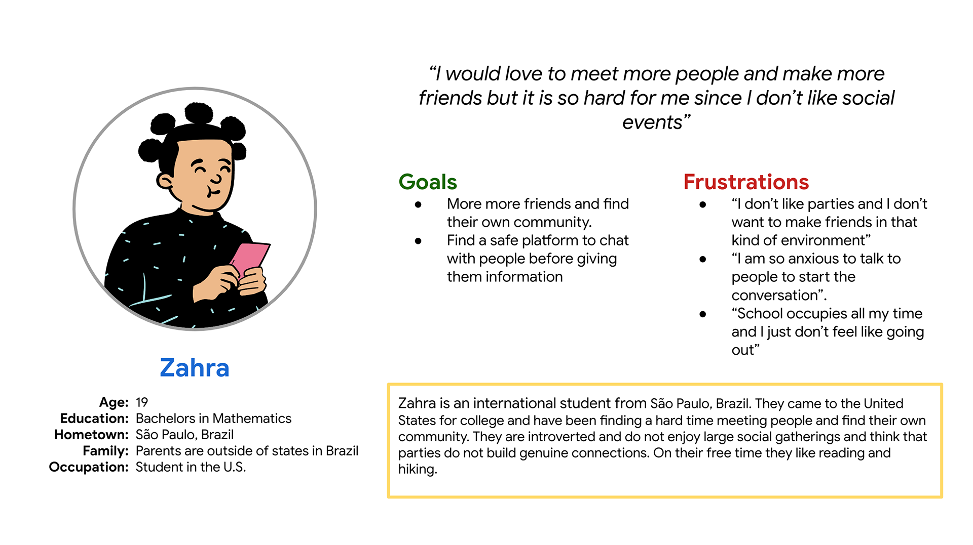
UNDERSTAND THE USERS
From user interviews I was able to create a persona representing the common user.
As more online platforms emerge, people still seek similar outcomes: meeting new people, staying informed, and sharing interests and passion. Most importantly finding a sense of connection, community, and belonging.
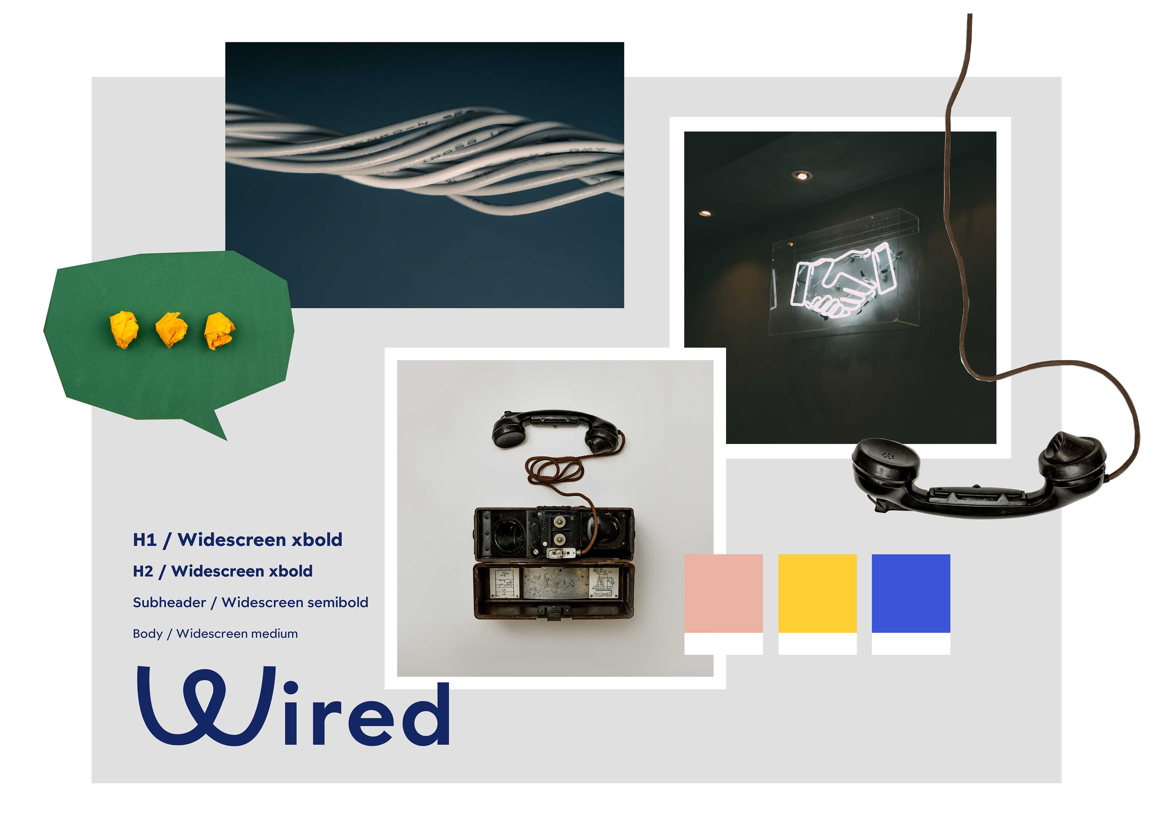
ESTABLISH THE BRAND
The brand should convey a sense of community, connection, and inclusivity.
It should be a welcoming and supportive place where users feel comfortable sharing their interests, experiences, and ideas with others.The platform should also be easy to use and navigate, with a clean and intuitive interface that makes it easy for users to connect with others and find what they are looking for.
THE "W"
The logo for Wired features a bold yet playful "W" shaped like a wire. The wire is meant to symbolize the connectivity and interconnection of the platform, as well as its focus on bringing people together.
It is surrounded by a clean and simple typeface, which helps to balance the boldness of the wire and gives the logo a sense of balance and stability. The logo is intended to be eye-catching and memorable, while also conveying the platform's values of innovation and connection. It is meant to be versatile, able to be used across a variety of mediums and contexts.
THE COLORS
The use of color can help to create a cohesive and distinctive visual identity that effectively communicates the values and personality of a brand, which is why I chose these colors.
Bold yellow is often associated with happiness, optimism, and creativity, conveying a sense of positivity and energy. It is also highly visible and eye-catching, making it effective for attracting attention.
Pale pink is often associated with feelings of warmth, tenderness, and love, making it a good choice to convey a sense of femininity, caring, or nurturing.
Cobalt blue is often associated with feelings of trust, reliability, and stability, effectively conveying a sense of professionalism or dependability. It is also often associated with intelligence and creativity, making it effective for brands that want to convey a sense of innovation or ingenuity.
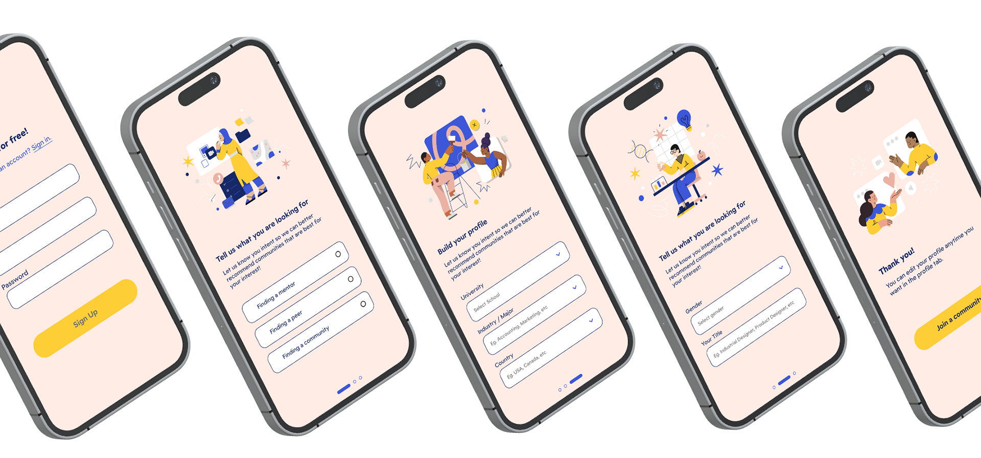
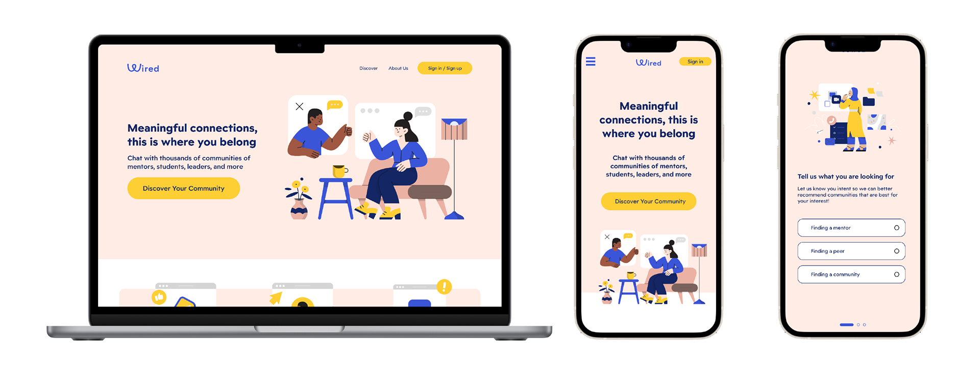
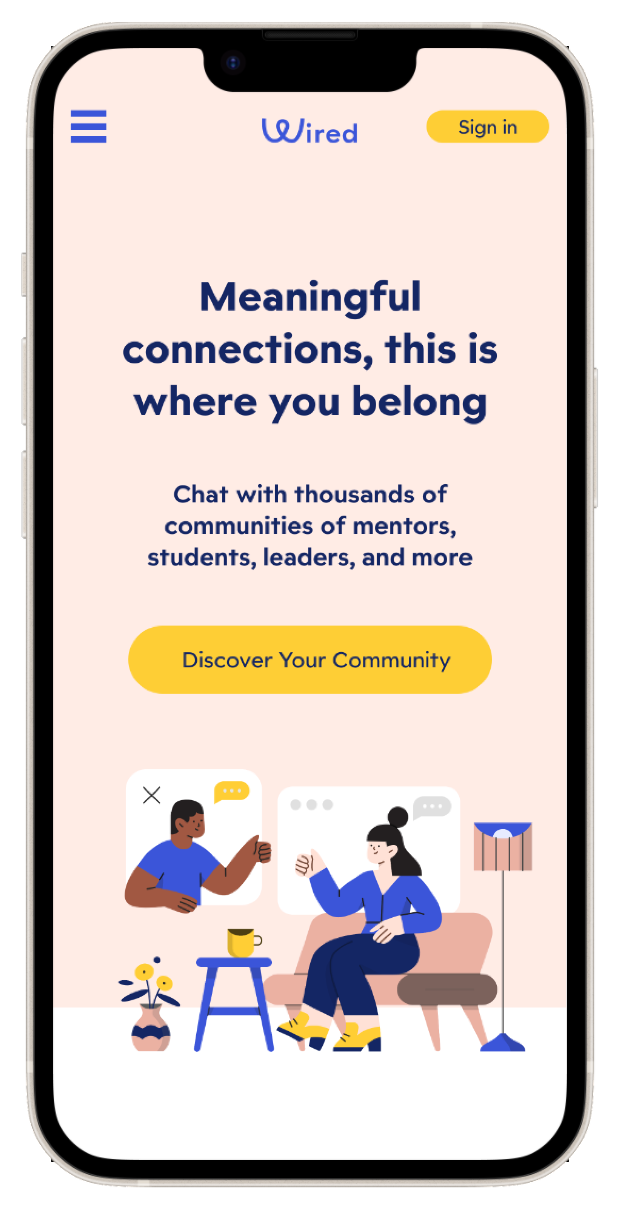
PROTOTYPE
Developing a prototype helped me convey how the design would look in my web design.
CLOSING THOUGHTS
This project was a valuable learning experience that allowed me to develop both my visual design and user experience design skills, and also helped me understand how to create a user-centered design.
The next step for me is to develop a functional high fidelity prototype to allow me to do further user testing.