THE PROBLEM
1 in 4 Americans have a disability though not a lot of people are educated to understand or know how to accommodate with various assistive technology.
It is difficult to understand the difficulties people face through reading only. My goal is to design an app that will improve education on disabilities, thus allowing them to apply the knowledge to improve their own products.
UNDERSTANDING THE USERS
I conducted user interviews to learn more about designers’ perspectives on accessibility when designing. Most interview participants reported they commonly consider accessibility when designing products but have to do a lot of research to be able to understand the plethora of disabilities. The feedback received through research made it very clear that users would want to learn more about disabilities if they had access to an easy-to-use tool.
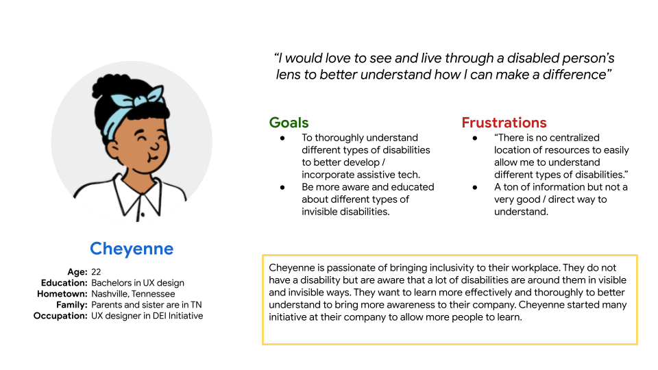
PERSONA
Creating a persona helped me understand the user story and create a problem statement to better focus on pain points to target during the ideation phase.
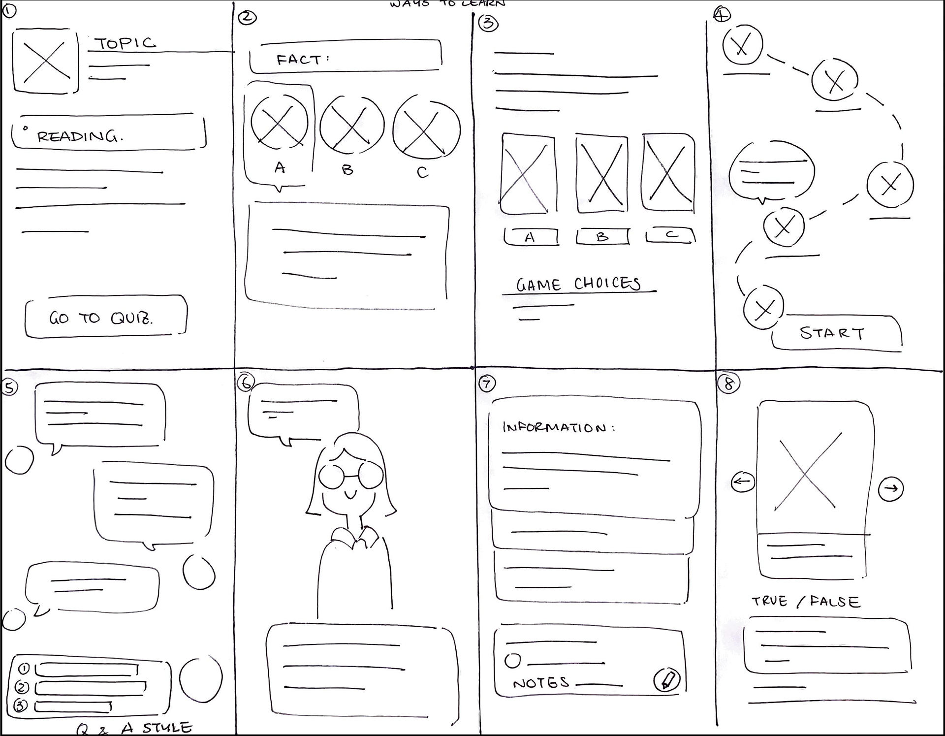
IDEATION
I did a quick ideation exercise to come up with ideas for different ways of learning through activities - a gap identified in the competitive audit. My focus was specifically on intuitive / effective ways to learn.
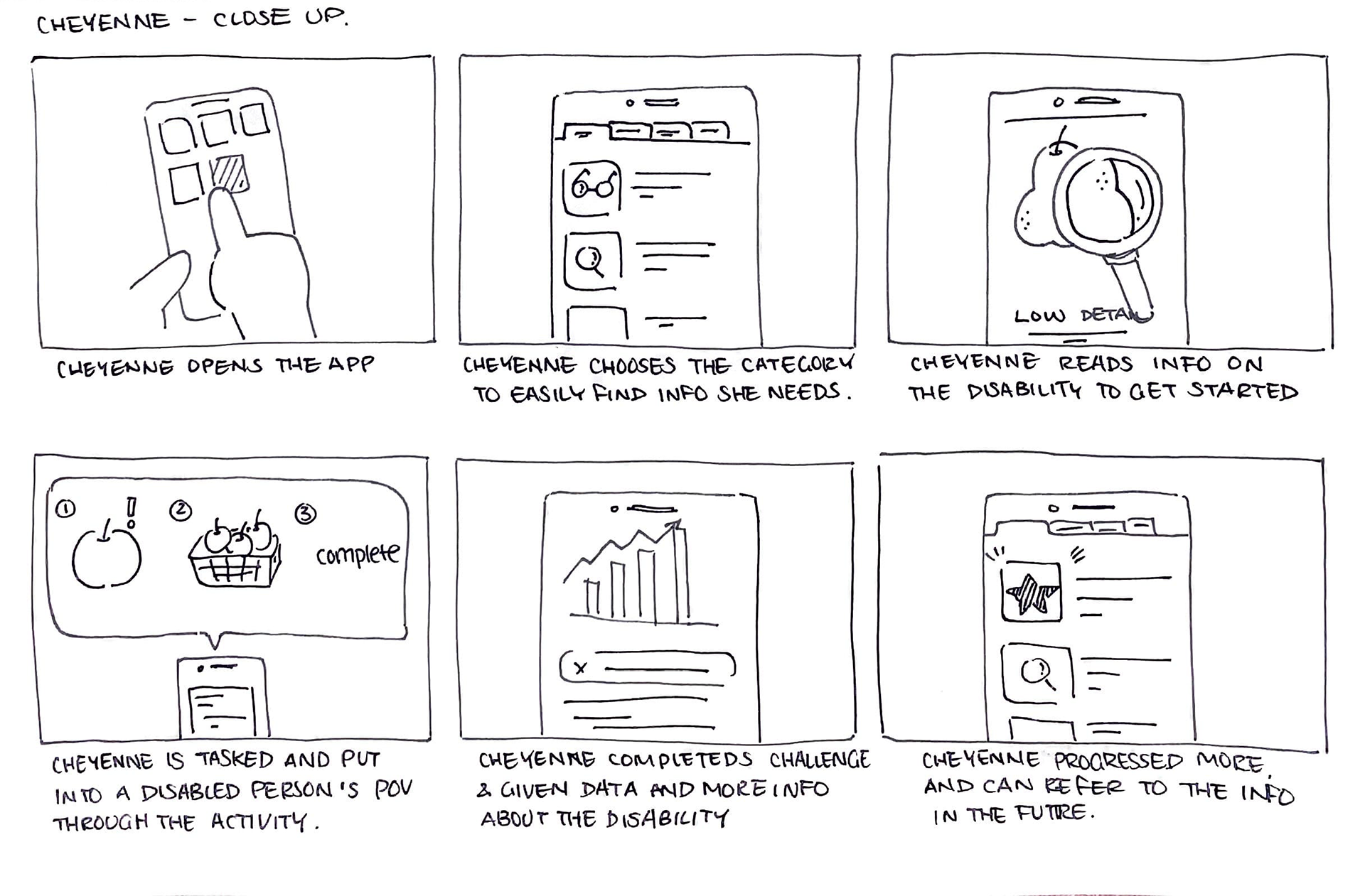
CLOSE-UP
I developed big picture (not shown here) as well as close-up sketches to explore, visualize, and refine my ideas. This process helped me identify and focus on important details I wanted to design.
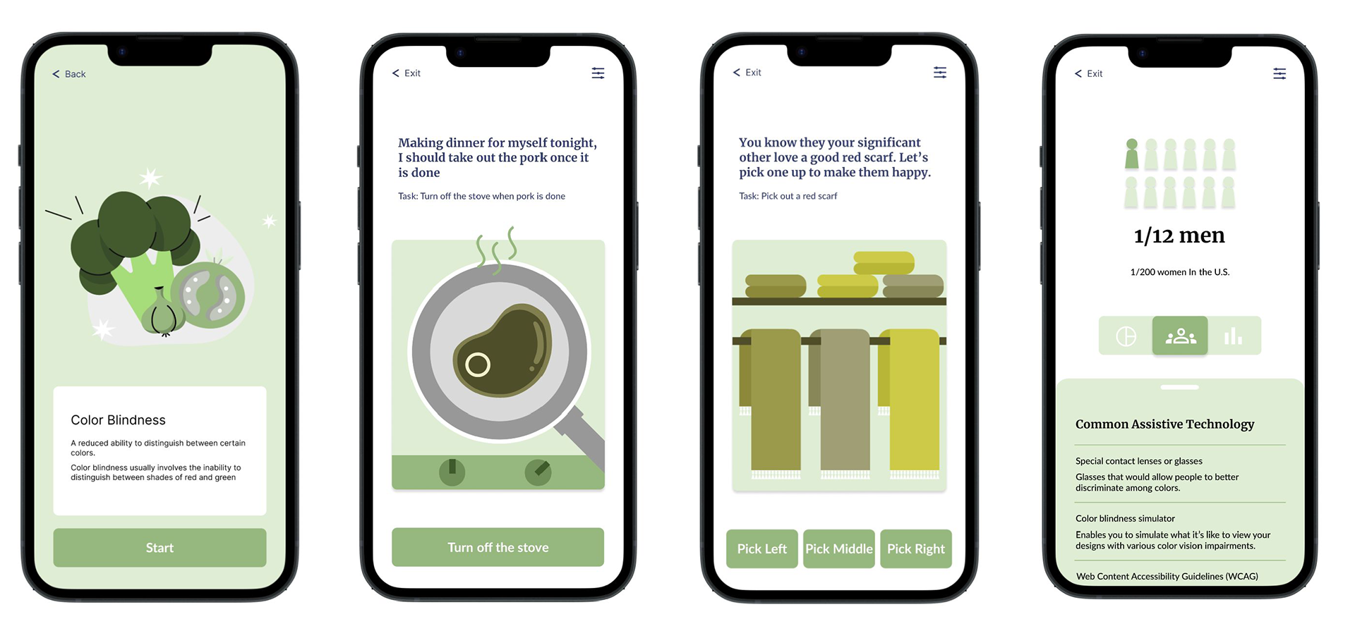
STARTING THE DESIGN
Creating the activity and content was the most challenging part of the process. I needed deep understanding of several disabilities to accurately represent the scenarios.
Referencing many research papers and various studies on Dyslexia, Color Blindness, and Low Level of Details, I was able to educate myself to understand people's different struggles throughout a typical day.
Wireframe consist of this process:
1. Activity introduction
2. Interactive activities
3. Congrats page
4. Data and technology
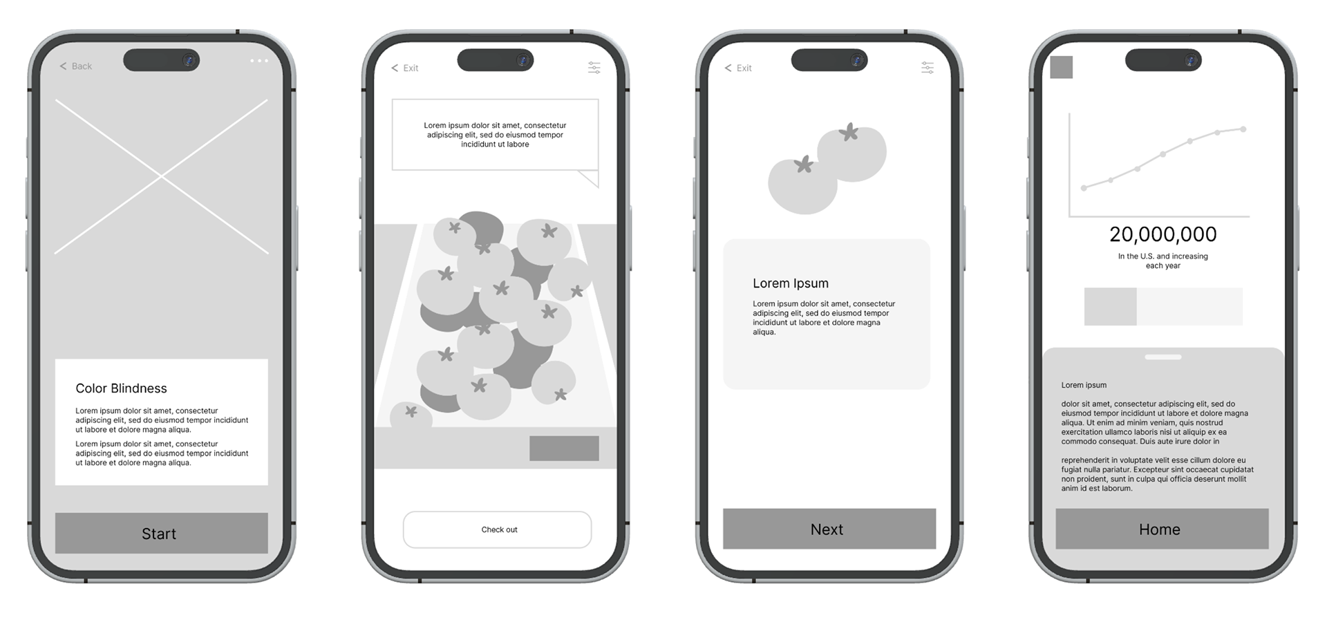
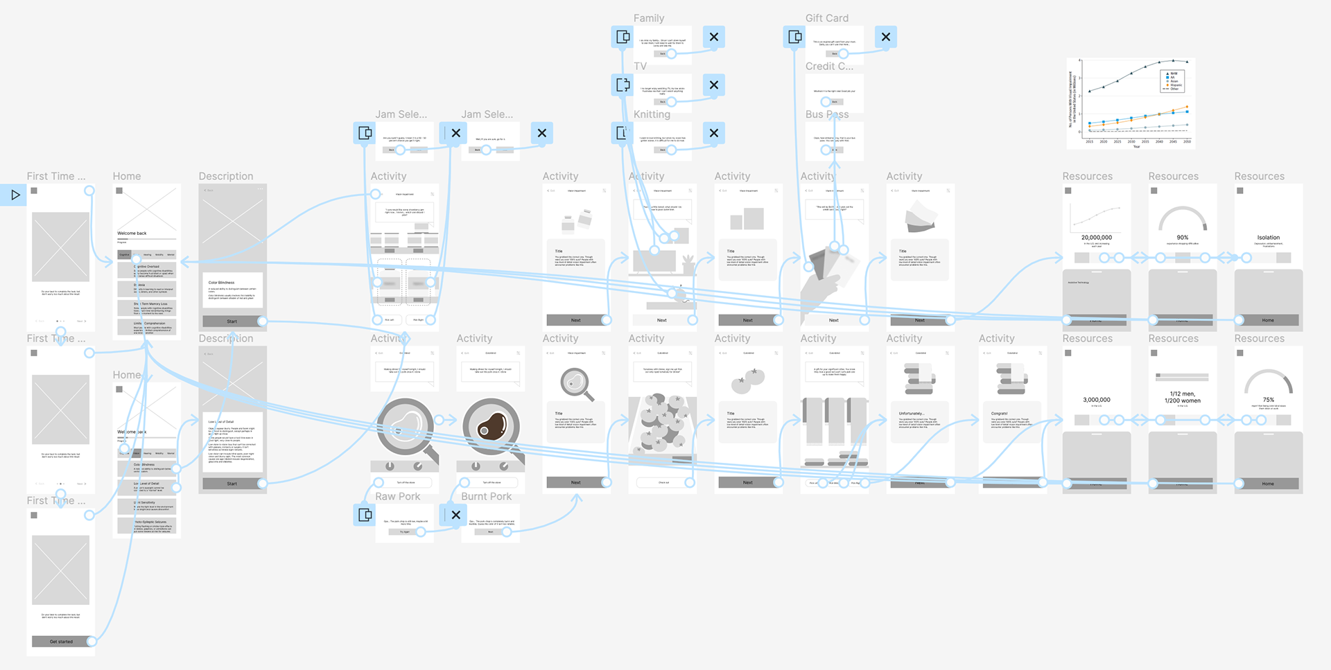
LOW FIDELITY PROTOTYPE
To prepare for usability testing, I created a low-fidelity prototype that focused on the various activities and the completion rate.
View the full low fidelity prototype here
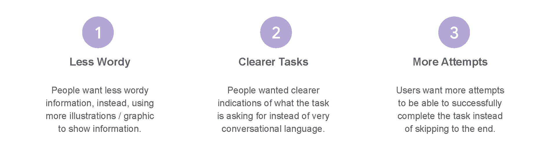
USABILITY TESTING
By conducting an unmoderated usability test, the interviews informed me the following themes
MAKING THE CHANGES
Based on the insights from the usability studies, I applied design changes to better develop the designs from wireframes to mockups.
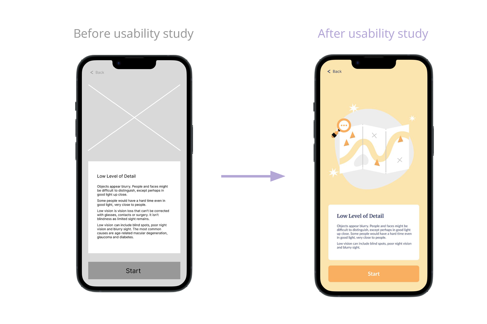
LESS WORDY
During the usability study, many pointed out the activity intro was too wordy, making it difficult for the reader to understand the main points thus to become less engaged in the text.
less wordy introduction is more likely to hold the reader's attention, making them more likely to continue reading
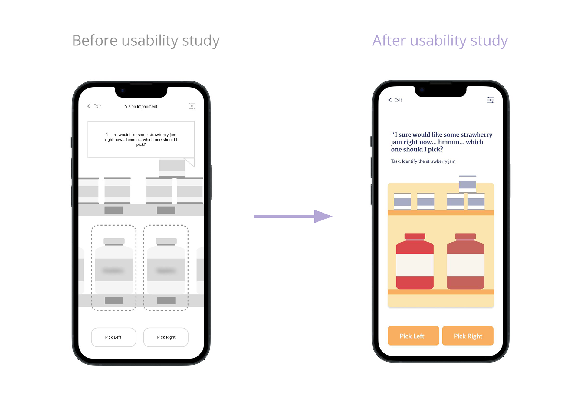
CLEARER TASK PROMPT
During the user testing, users were confused frequently about what the activities tasks were.
Due to all the elements having similar hierarchy made it hard for users to understand the activity task.
By establishing better hierarchy with the help of colors, the design improved understanding and reduced confusion and ambiguity
HIGH FIDELITY PROTOTYPE
To prepare for usability testing, I created a low-fidelity prototype that focused on the various activities and the completion rate.
View the full high fidelity prototype here
Thank you