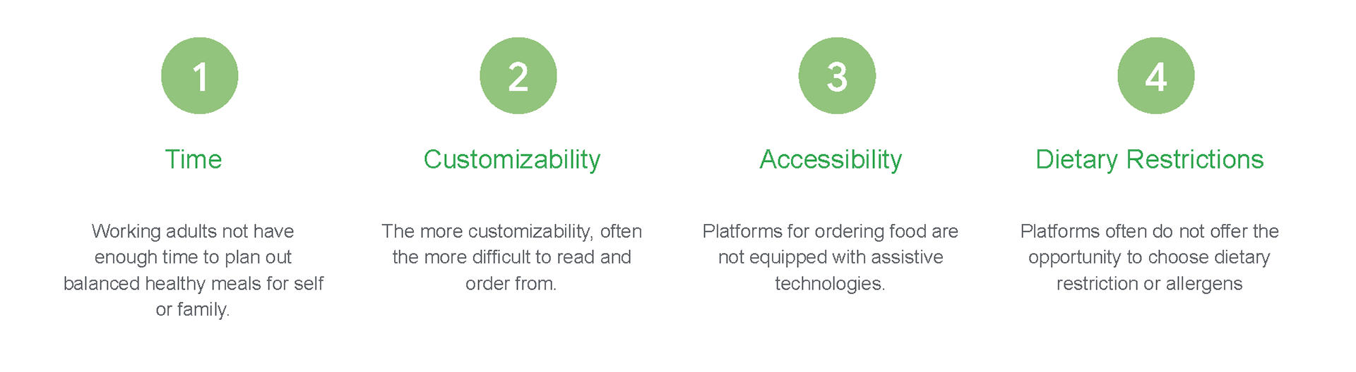
THE PROBLEM
People wanting to start a better eating habit have little idea on how to start and find the lifestyle challenging.
Healthy eating lifestyle requires not only self control, but also a lot of time and energy. Often, this lifestyle can influences people themselves as well as their friends/family. Thus, they need a better way to:
1. Variety conscious for self and family
2. Save time managing diet
3. Low risk palette expansion

UNDERSTANDING THE USERS
I conducted interviews and created empathy maps to understand the users I’m designing for and their needs.
A primary user group identified through research was nutrition conscious adults wanting a better eating habit but having no time or method of planning meals. This user group confirmed initial assumptions, but research also revealed pain points often encountered when ordering food.
INITIAL DESIGNS
Taking the time to draft iterations of each screen of the app on paper ensured that the elements that made it to digital wireframes would be well-suited to address user pain points.
Paper Wireframe
I prioritized efficiency and intuitiveness, allowing users to see the featured items and access important features right away.
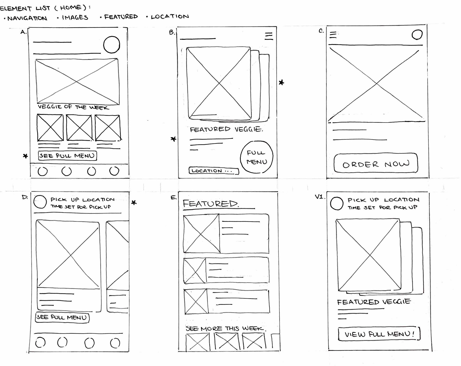
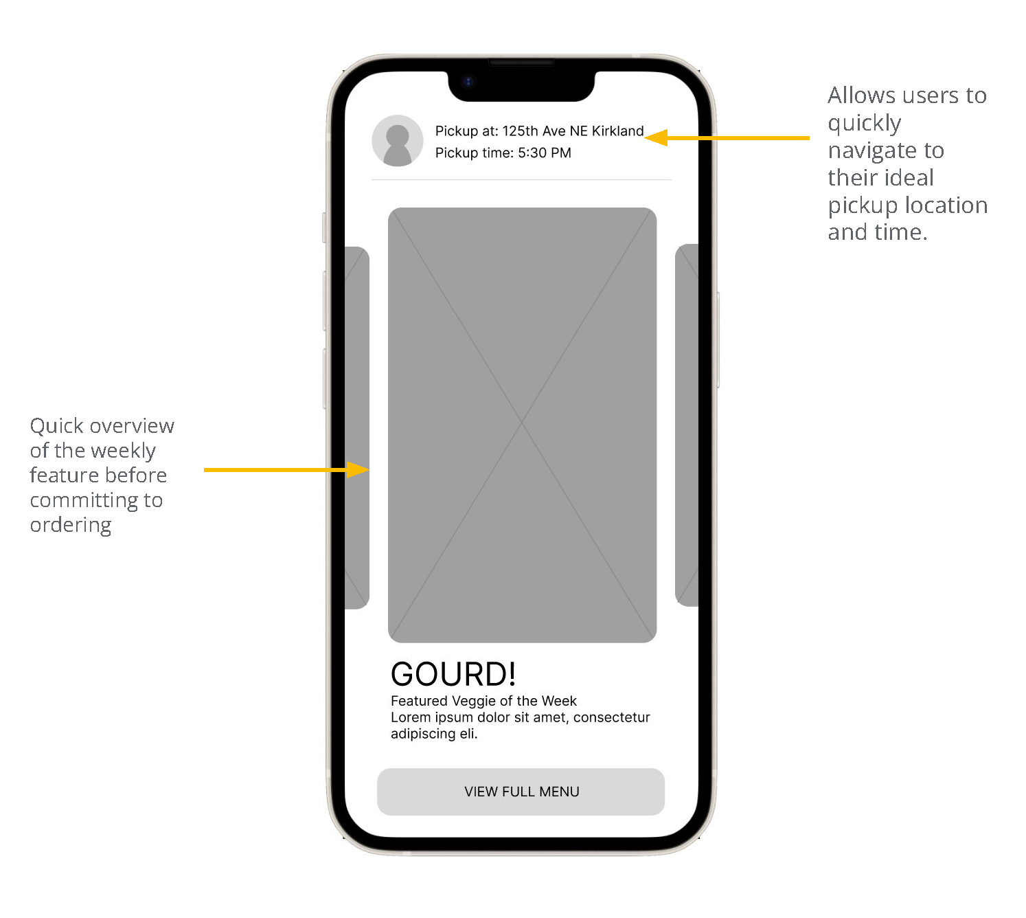
Home Page
Users wanted to efficiently view the featured produce to decide whether they would like to proceed to order.
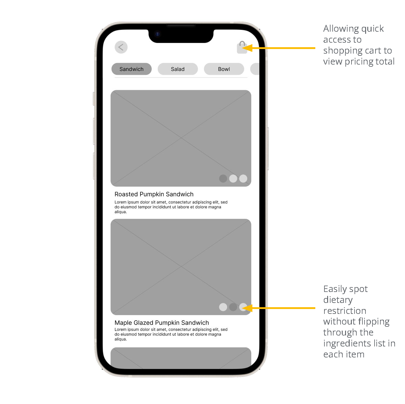
Menu Page
Efficiency was a key user need - allowing users to easily identify allergen or navigate to next step in the ordering process
LOW FIDELITY PROTOTYPE
The primary user flow I connected was the initial feature page and the menu navigation processes to validate my assumptions.
View low fidelity prototype here.
REFINE DESIGN
Findings from the usability study helped guide the designs from wireframes to mockups.
View a detailed break down of the usability study here. From the study I was able to synthesize and create themes to refine the designs.
1. Users want a more straightforward way to customizing orders
2. Users want to see their order status in the app
3. Users want a more obvious way to select time and location
4. Users want to see how much items are and how much are in their cart
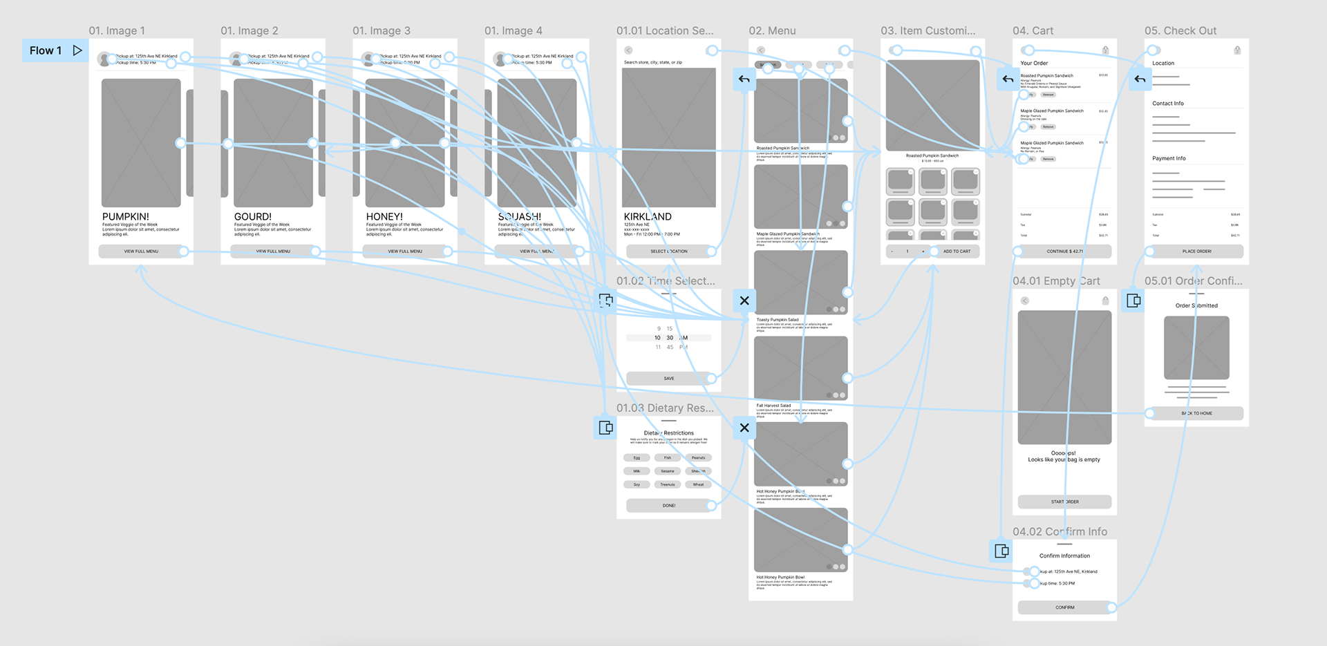
Customization
Though having all ingredients on one long list saved the need to flip through different pages, users were not able to find what they need easily.
The prototype after the usability study focused on categorizing ingredients, thus making it easier for users to identify wanted changes.
The prototype after the usability study focused on categorizing ingredients, thus making it easier for users to identify wanted changes.
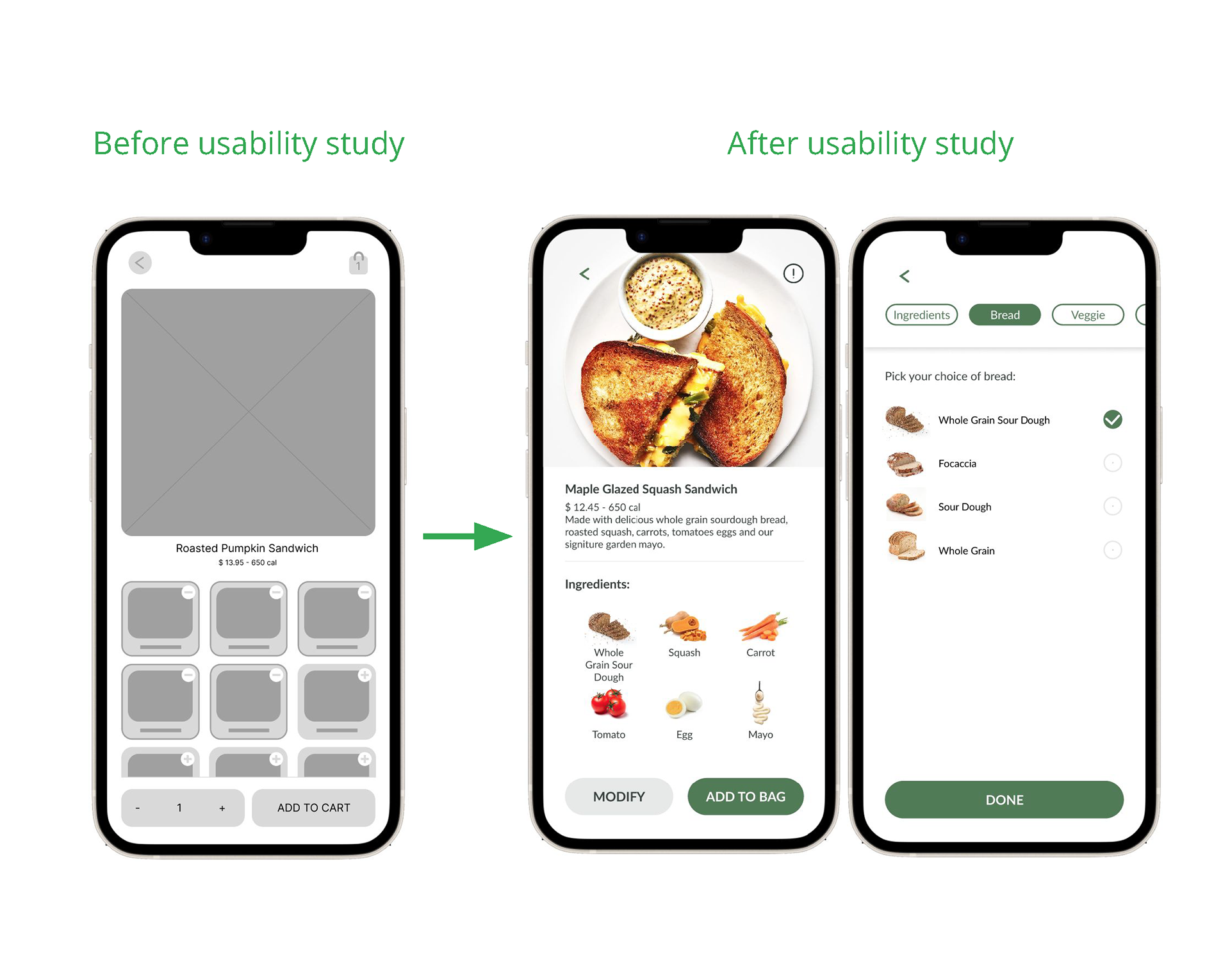
Feature Page
While providing many important features on one page allowed users to have the ability to start at different starting points, this often confused users on where to start.
The prototype after the usability study simplified the overall interface allowing for one directional process, which was a lot less complicated or confusing to users.
The prototype after the usability study simplified the overall interface allowing for one directional process, which was a lot less complicated or confusing to users.
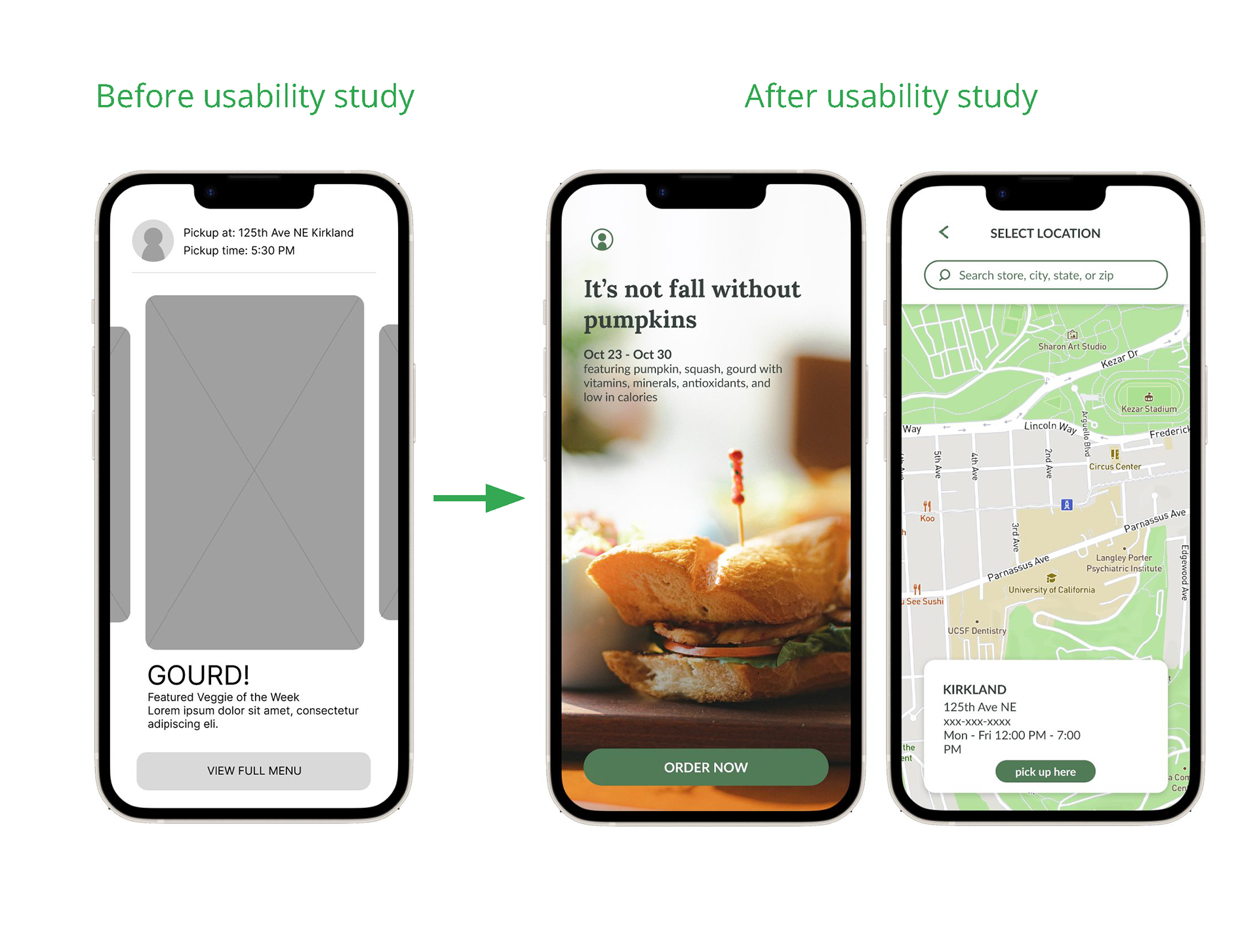
Menu Page
Users wanted more visibility to see how much each item costed and how many things are in their cart. The prototype after the usability study provides full transparency to users, providing them pricing without needing to dig through multiple pages.
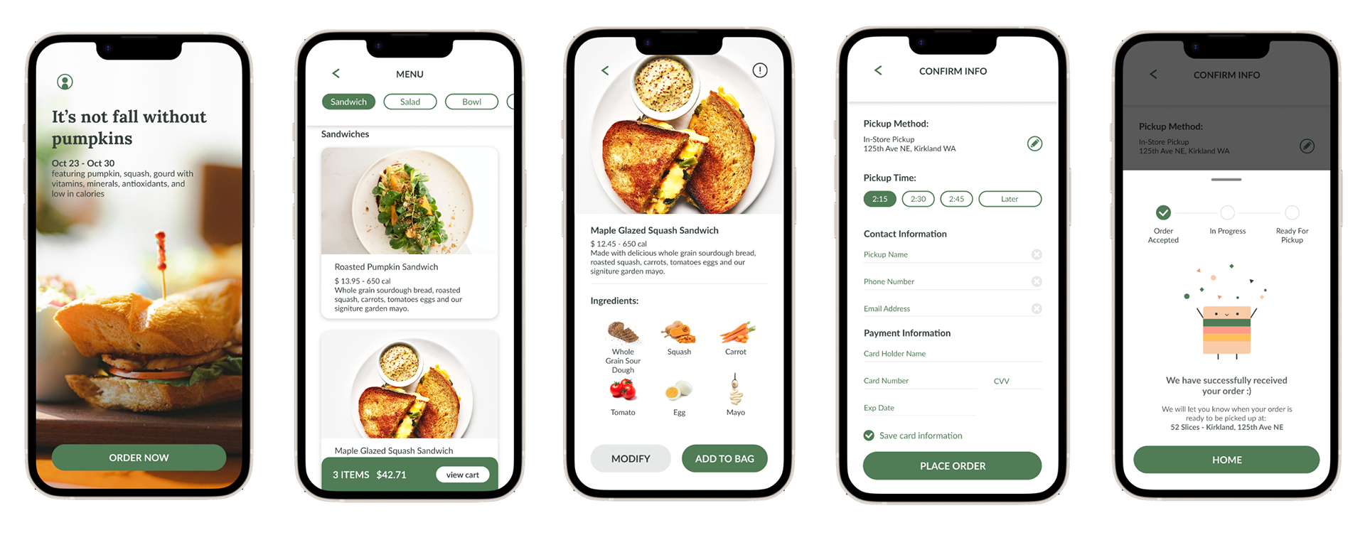
HIGH FIDELITY PROTOTYPE
The final high-fidelity prototype presented cleaner user flows for navigating through the menu and customizing orders.
View the full high-fidelity prototype here
CLOSING THOUGHTS
While being a designer gave me a really good idea about how to make the user flow efficient, very often, users do not use/understand the assumed flow. It is very important to test and test often to identify unclarity.
The next step for me is to prototype to make the app completely functional and conduct another round of usability studies to verify all changes are finalized.
Thank you very much for reading!